SeventhWave
Not every cocktail needs a bar. Some just need a wave
About the project
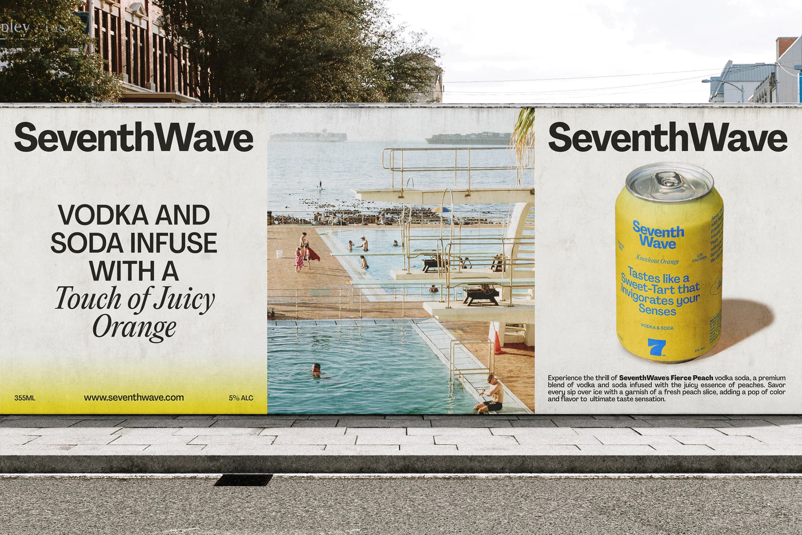
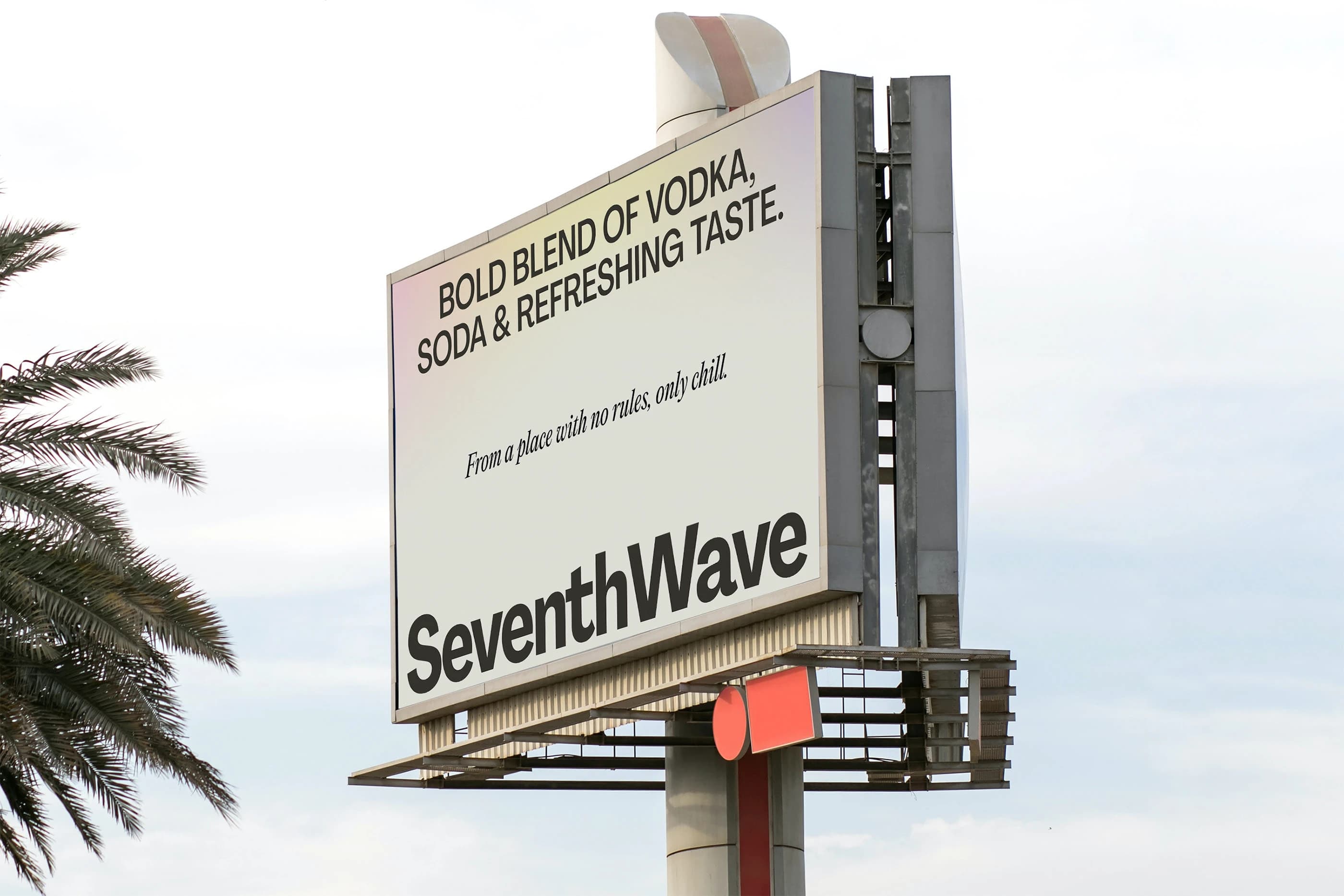
SeventhWave is built for the in-between moments. It’s built for warm air, long afternoons, and the kind of plans that happen naturally. The product is convenient, and the feeling is effortless.
The identity had to reflect that balance. Fun without being loud, and premium without being formal.
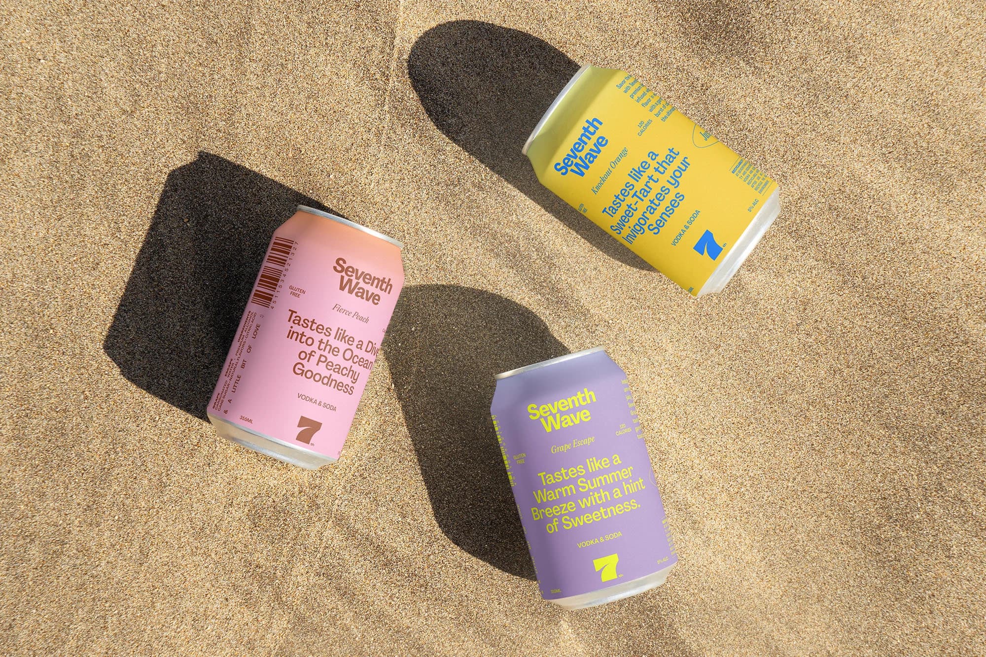
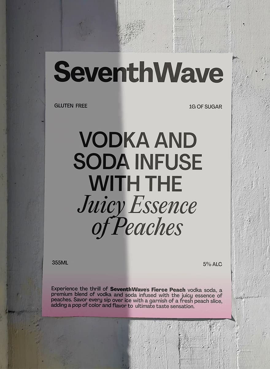
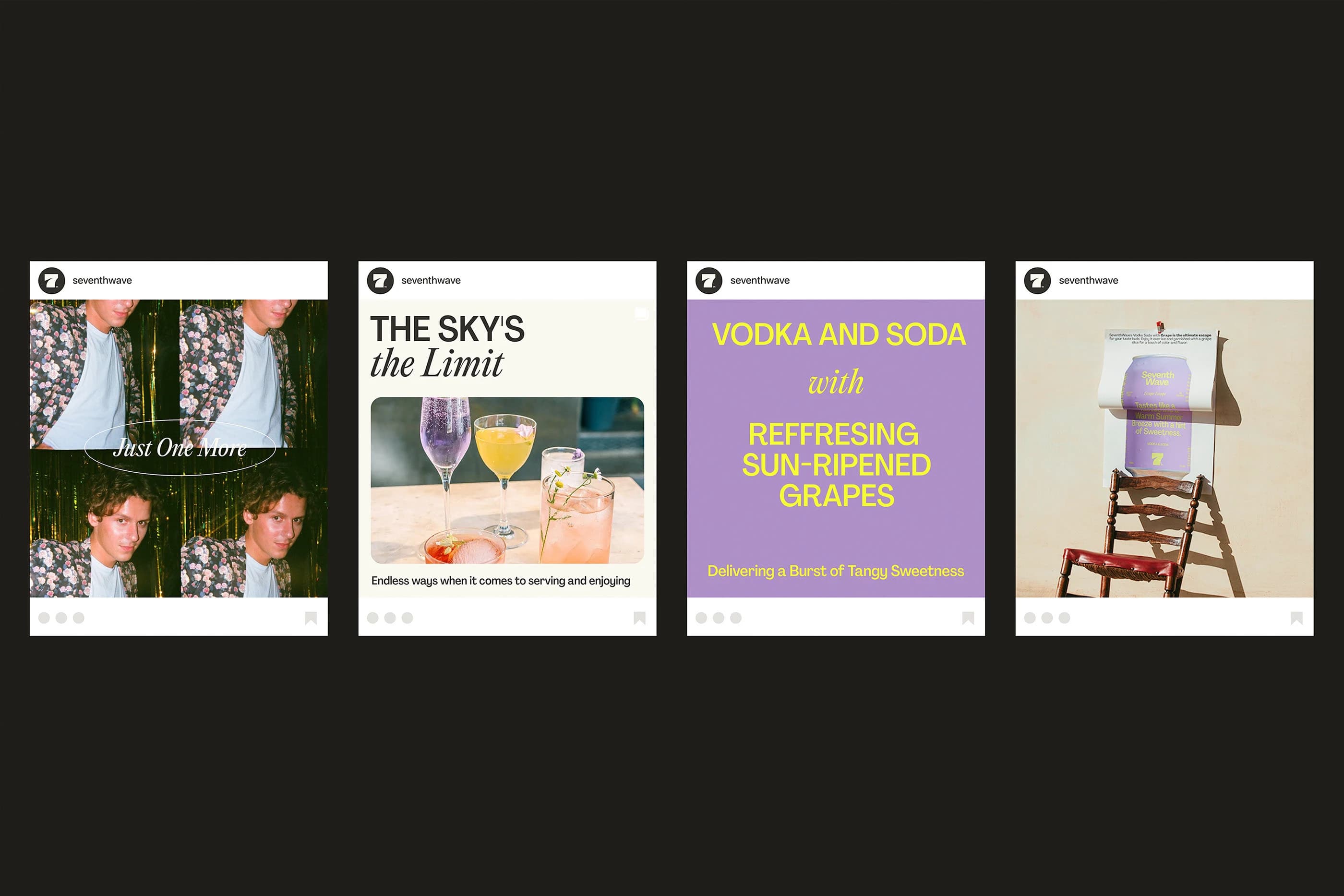
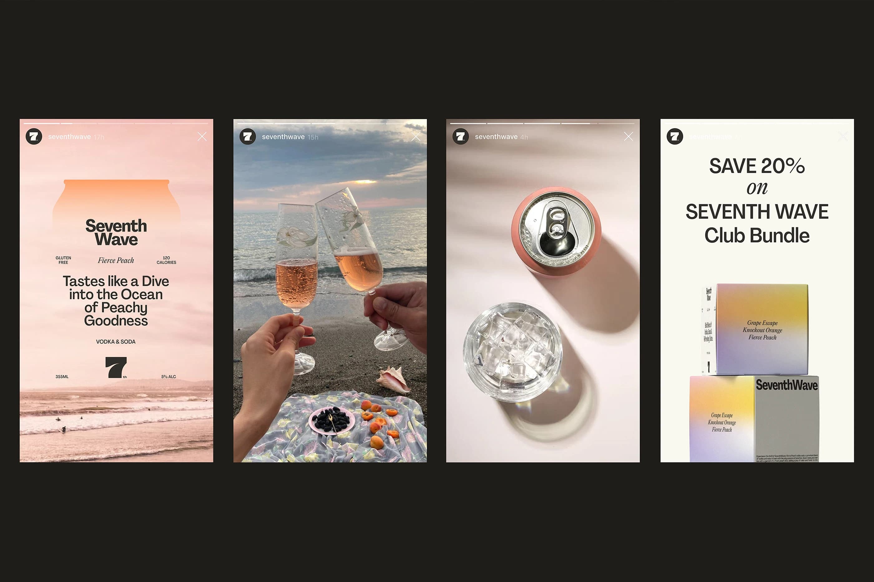
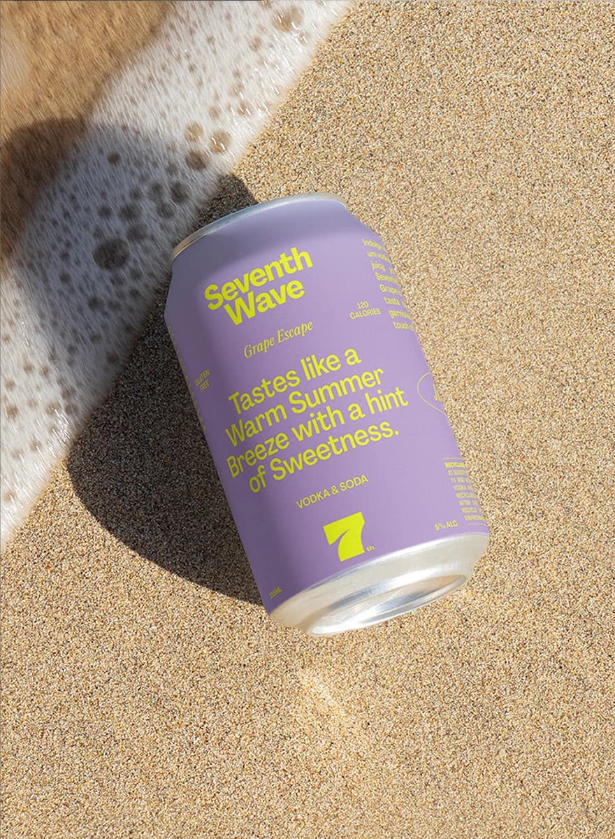
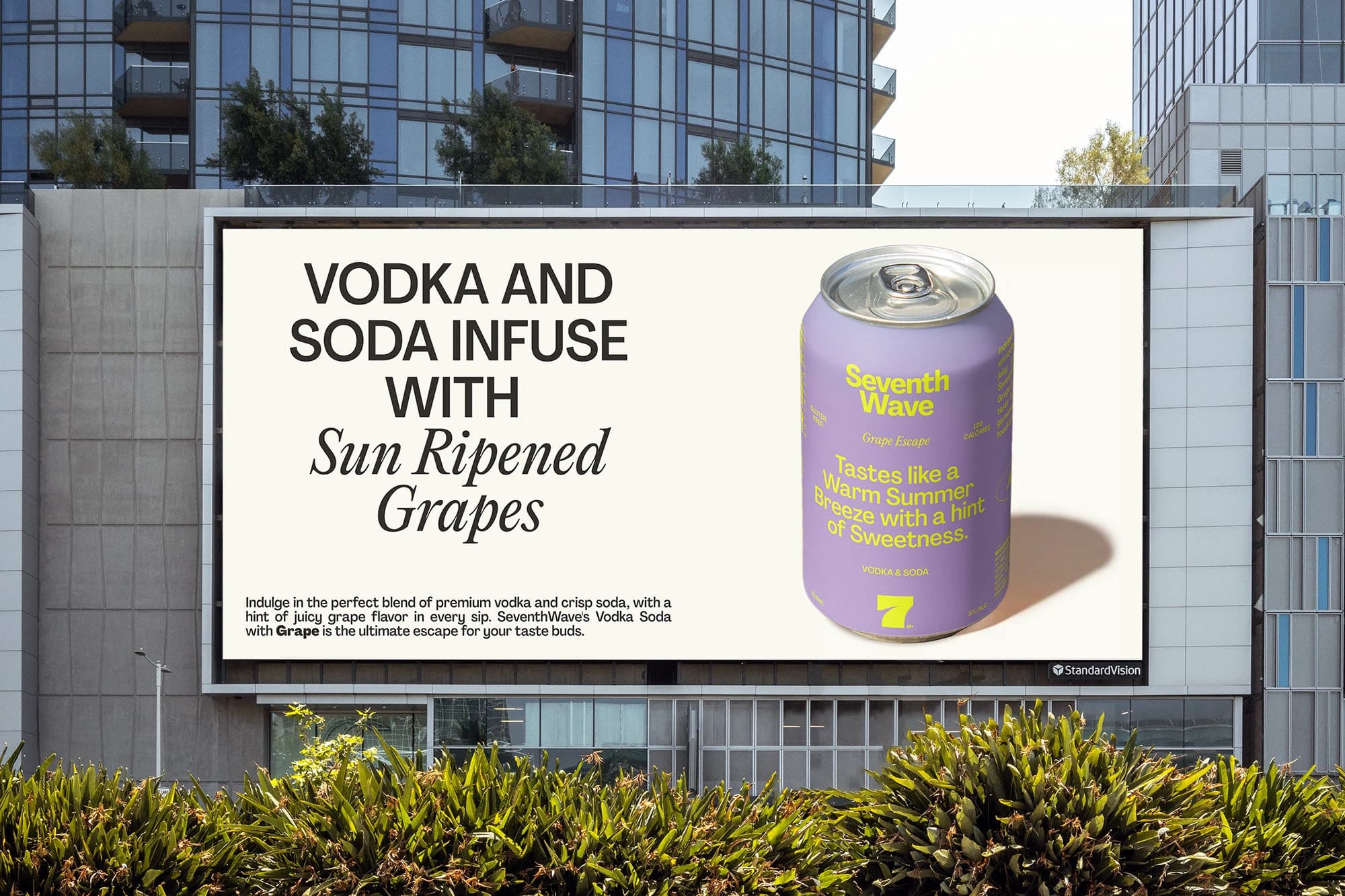
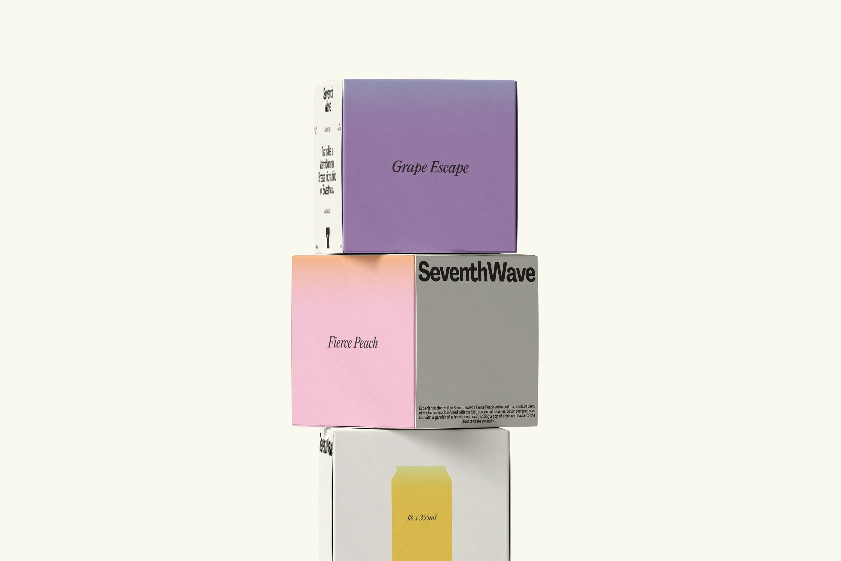
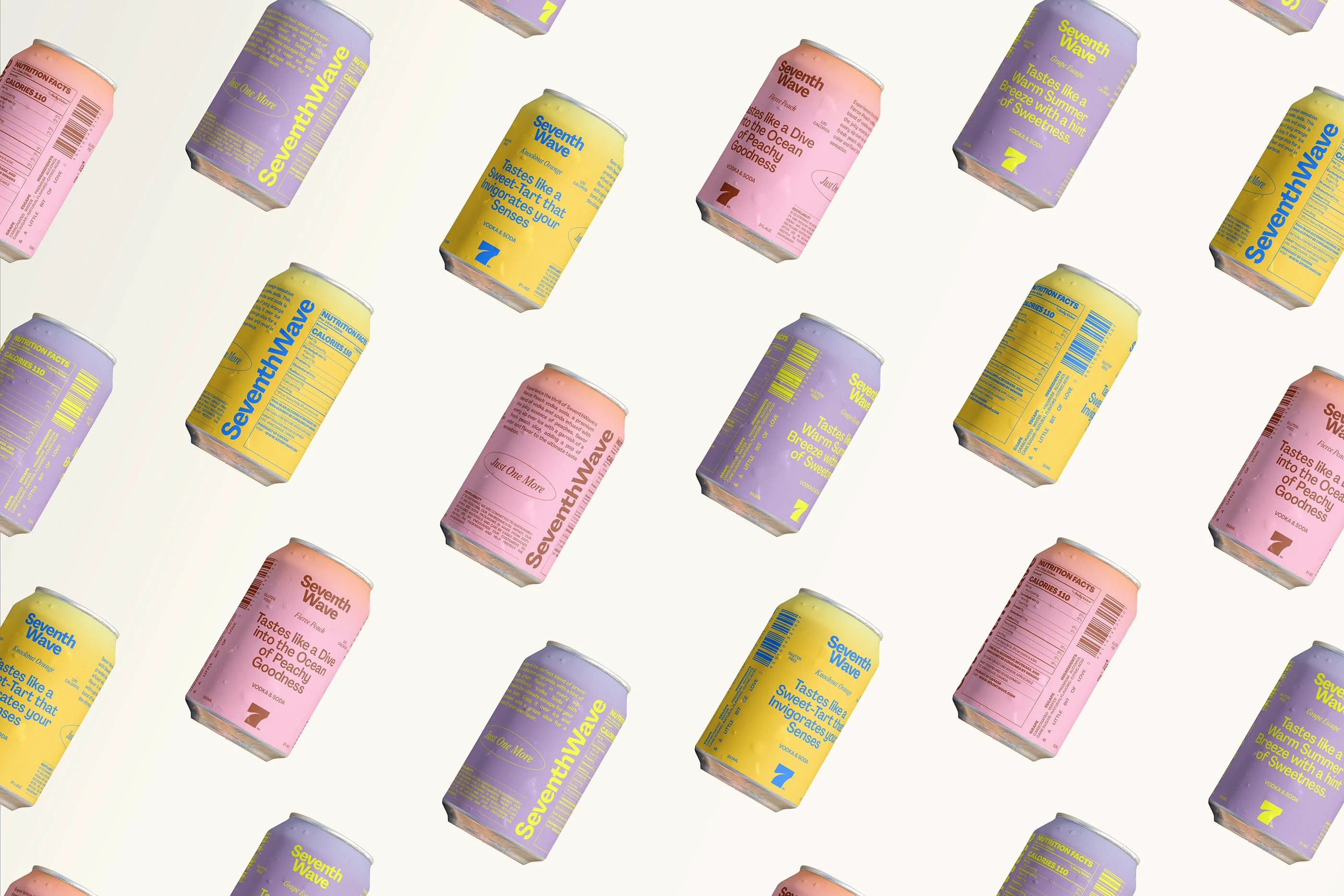
The color system does most of the storytelling. Soft gradients inspired by sky, water, and fruit create a sense of movement and freshness. Each flavor carries its own tone, but together they feel cohesive, like a sunset shifting from peach to violet.
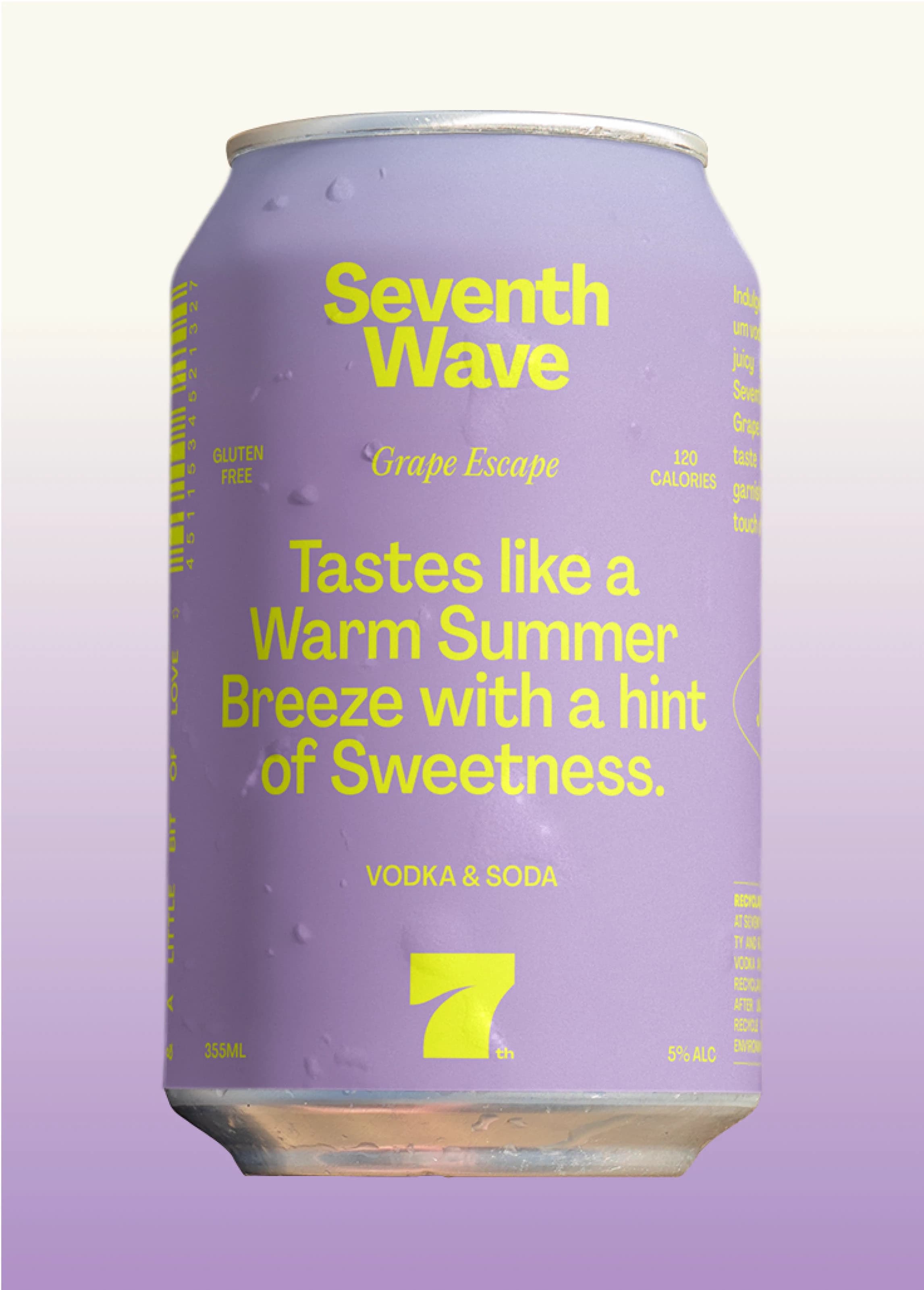
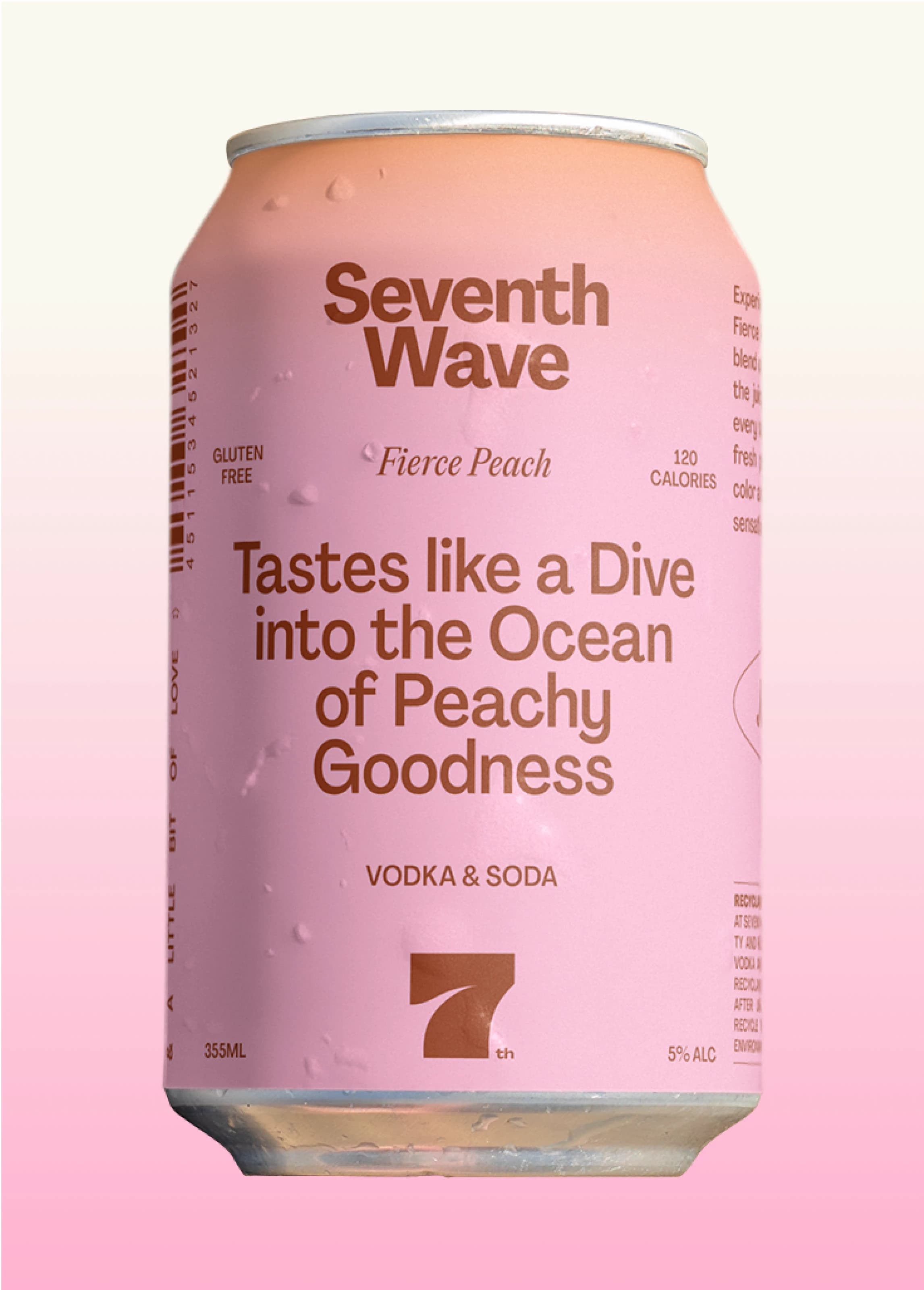
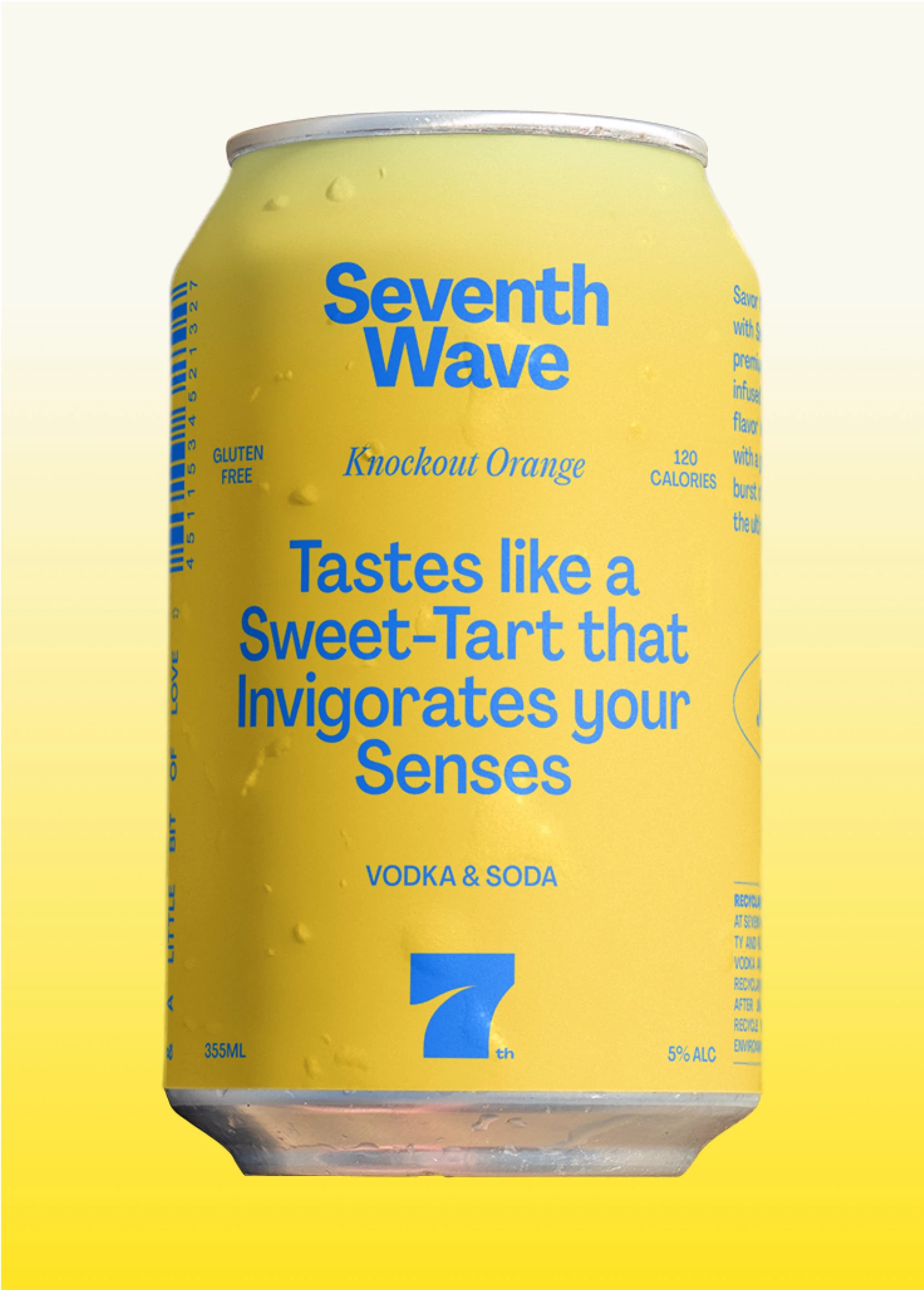
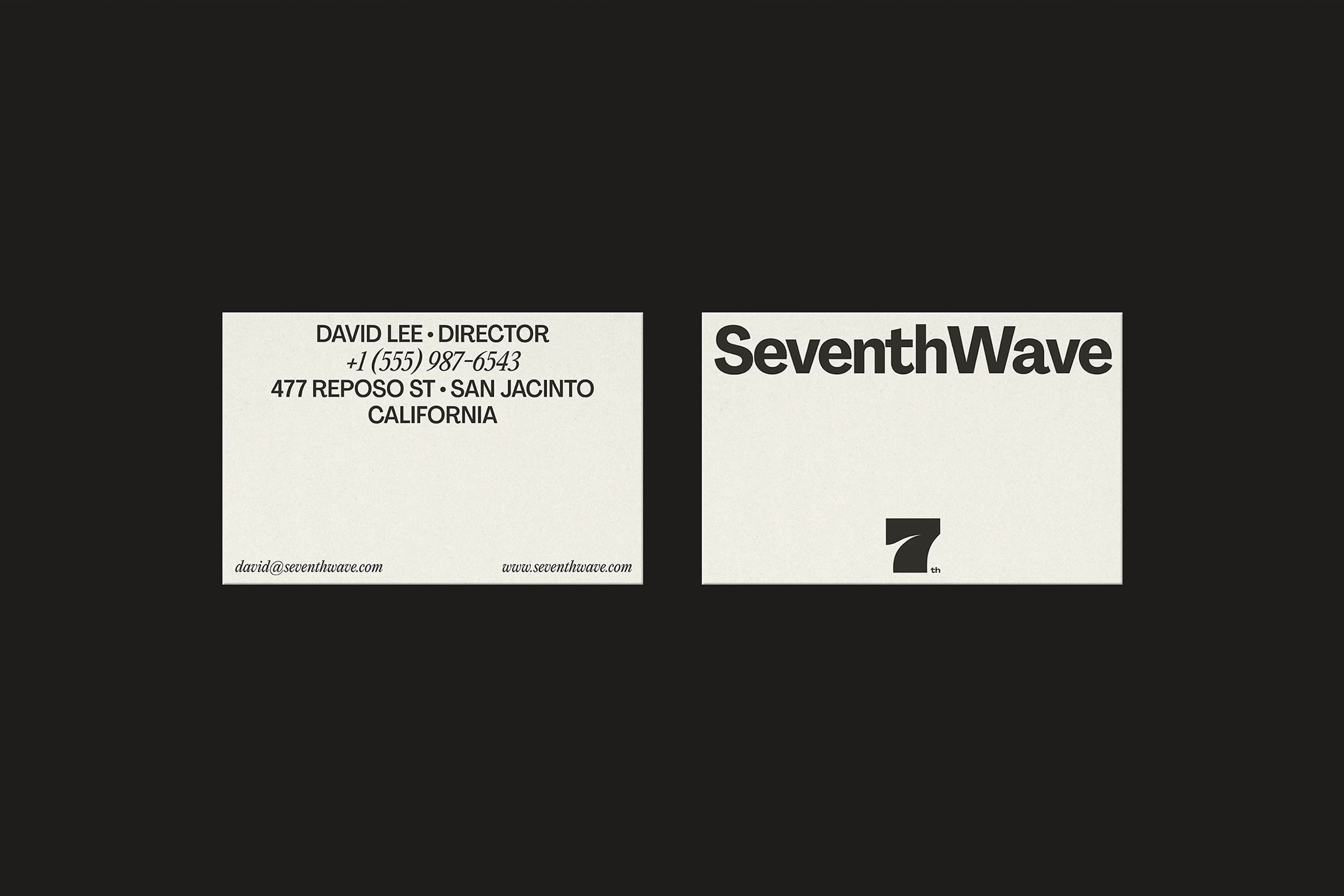
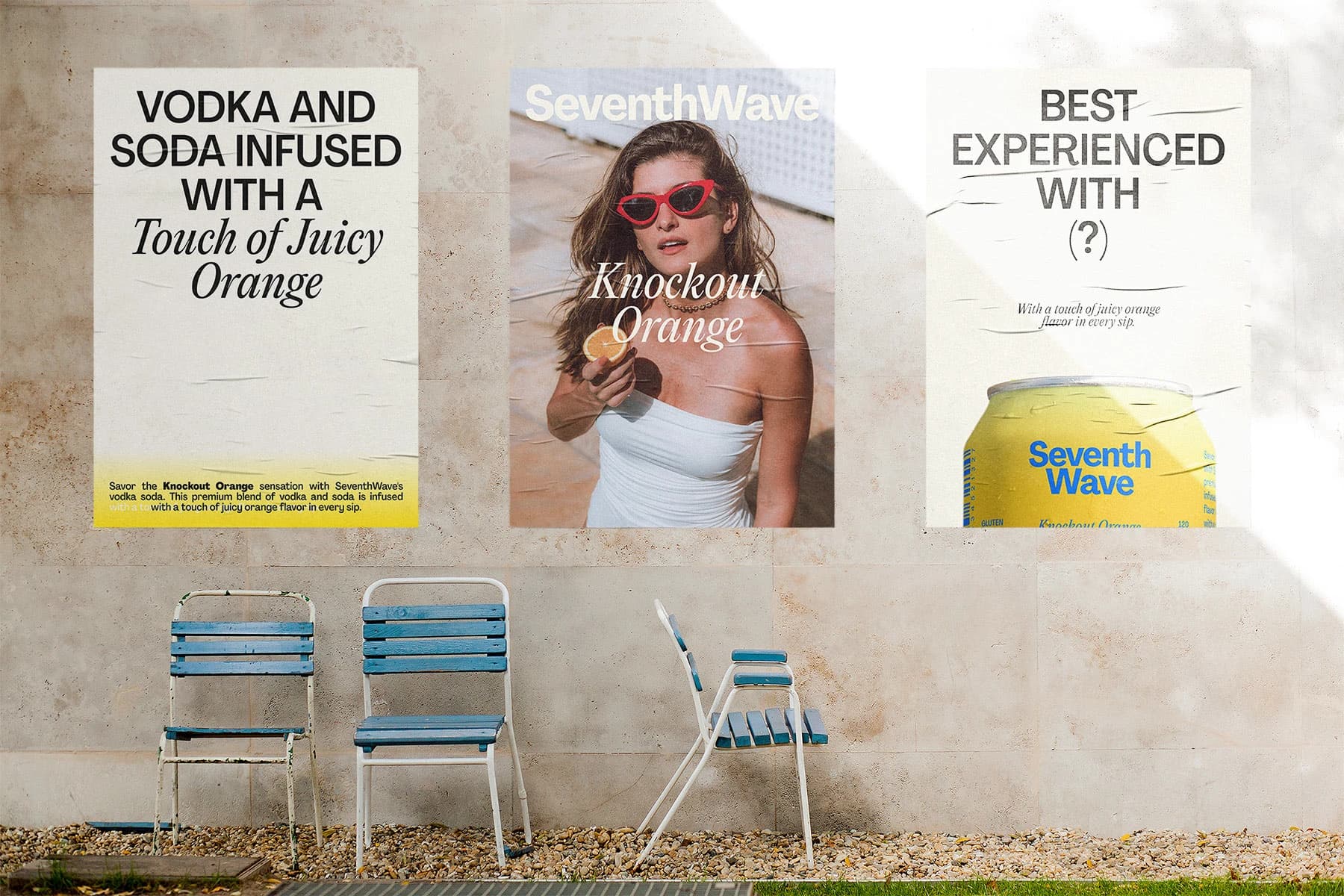
The Brand Identity
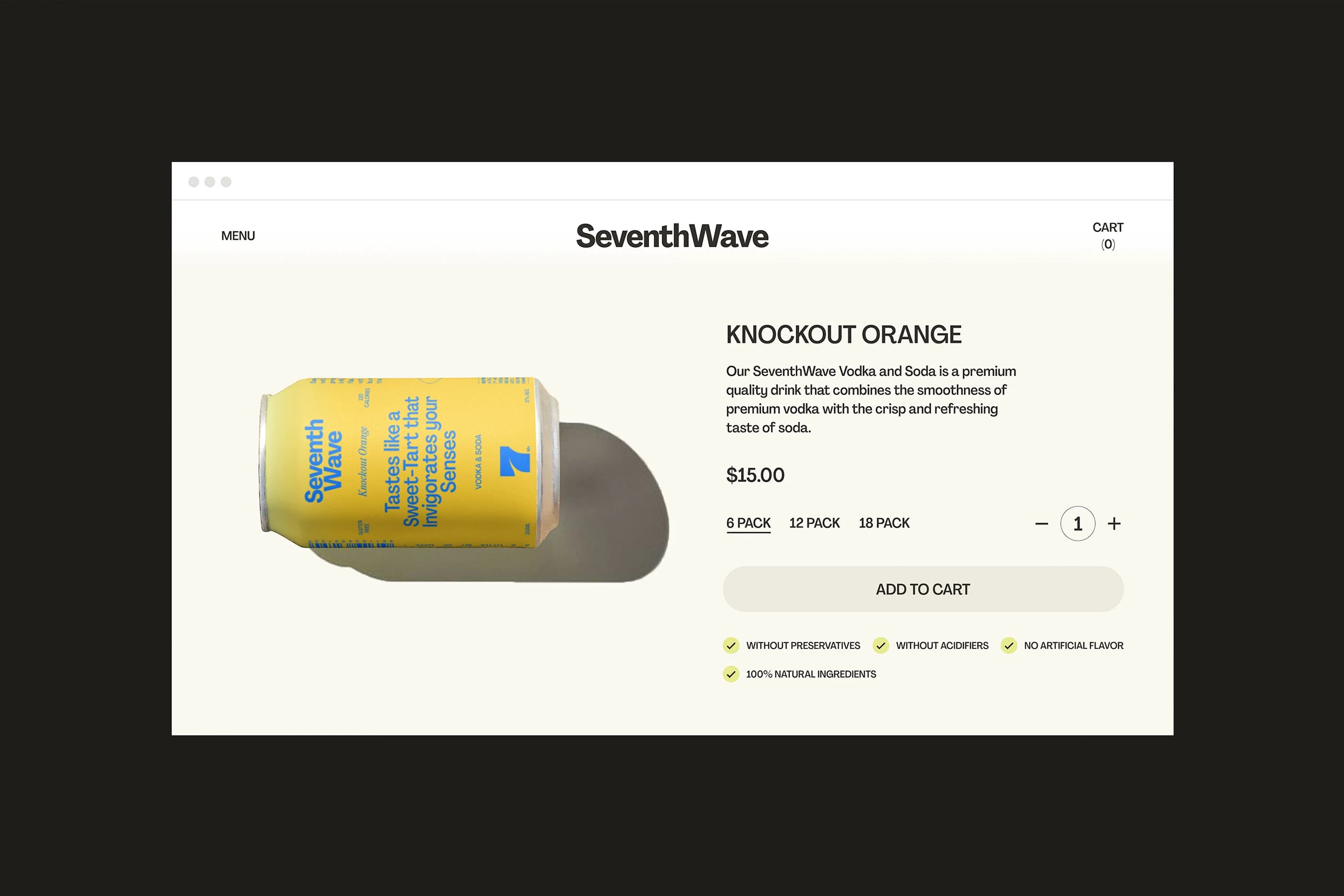
The wave mark is fluid and minimal, and a subtle symbol of rhythm and return. Something that feels continuous.
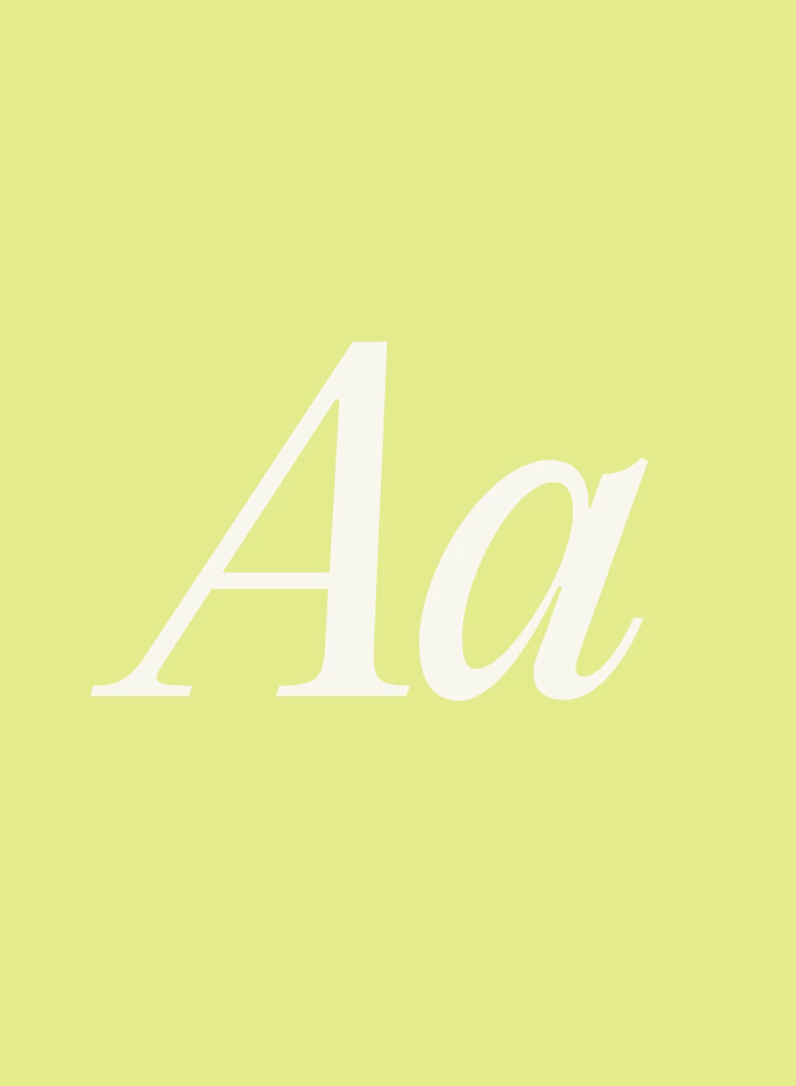
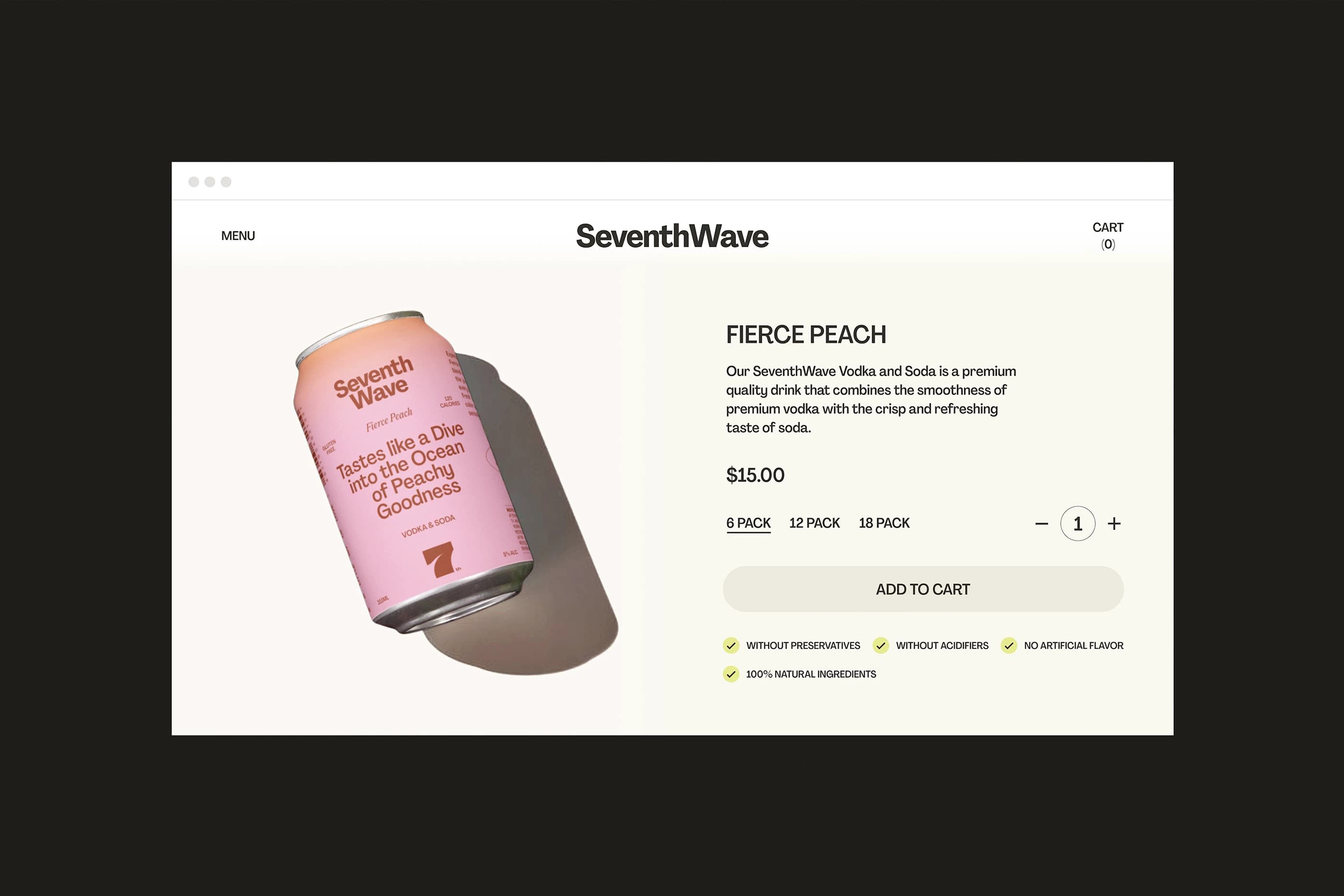
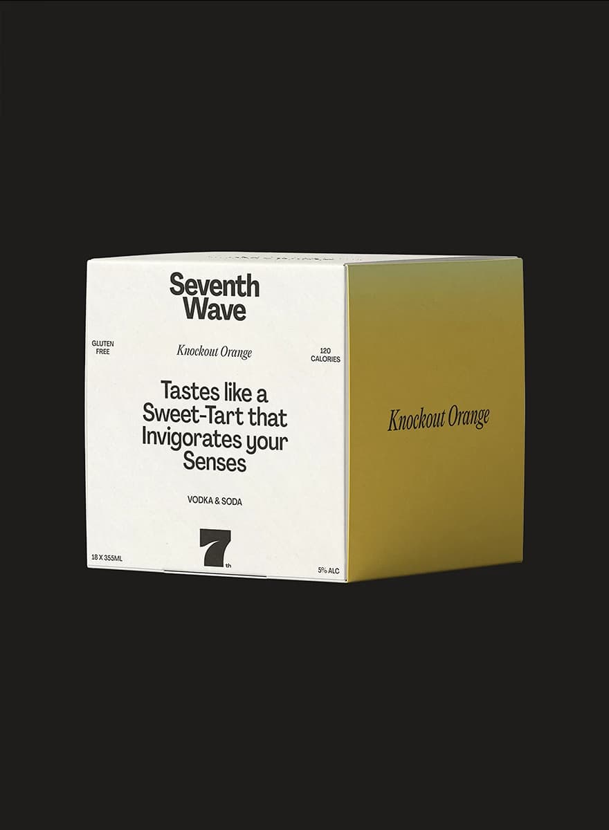
Typography stays clean and confident. Strong enough to hold presence on a shelf, light enough to feel relaxed in a social feed. The layouts leave space. The packaging breathes.
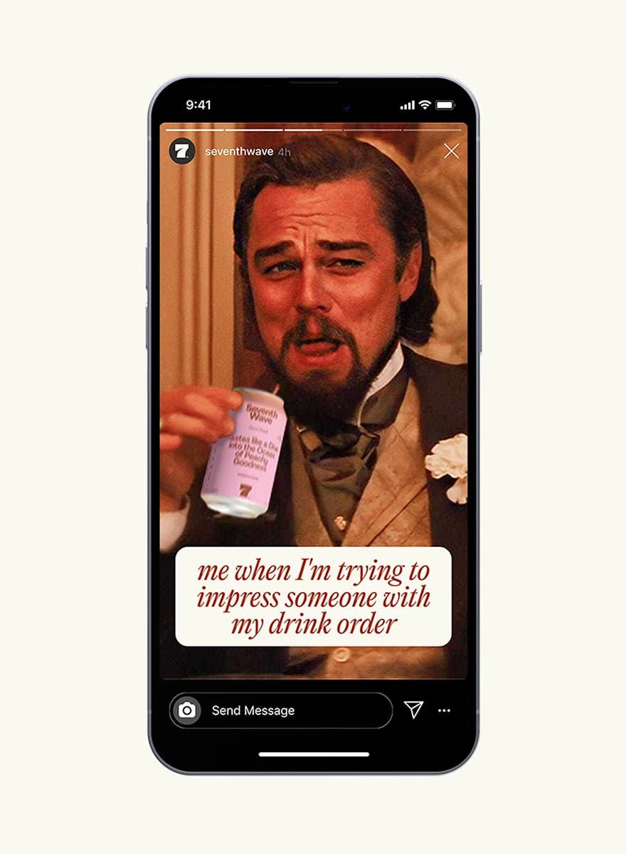
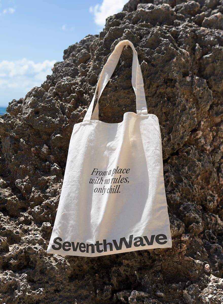
SeventhWave doesn’t try too hard. It feels like that moment when the music is playing, the glasses clink, and the air is still warm. And you don’t need anything more.